
Bootstrap
Bootstrap中文网:http://www.bootcss.com/
1.什么是 Bootstrap?
官方介绍:简洁、直观、强悍的前端开发框架,让web开发更迅速、简单。
- Bootstrap 下载
Bootstrap3下载地址:http://v3.bootcss.com/getting-started/#download
- Bootstrap 文件目录结构
1 | dist |
- Bootstrap 依赖
要想使用 Bootstrap ,那么必须先引入 jQuery(jquery.min.js)文件。
5.使用 Bootstrap
压缩版本适于实际应用,未压缩版本适于开发调试过程
直接引用官网下载下来的文件。
使用 Bootstrap 中文网提供的免费 CDN 服务。
1
2
3
4
5
6
7
8
9
10
11
<!-- 新 Bootstrap 核心 CSS 文件 -->
<link rel="stylesheet" href="http://cdn.bootcss.com/bootstrap/3.3.0/css/bootstrap.min.css">
<!-- 可选的Bootstrap主题文件(一般不用引入) -->
<link rel="stylesheet" href="http://cdn.bootcss.com/bootstrap/3.3.0/css/bootstrap-theme.min.css">
<!-- jQuery文件。务必在bootstrap.min.js 之前引入 -->
<script src="http://cdn.bootcss.com/jquery/1.11.1/jquery.min.js"></script>
<!-- 最新的 Bootstrap 核心 JavaScript 文件 -->
<script src="http://cdn.bootcss.com/bootstrap/3.3.0/js/bootstrap.min.js"></script>
- Bootstrap 基本模板
1 |
|
Bootstrap 实例精选:http://v3.bootcss.com/getting-started/#examples
全局 CSS 样式
HTML5 文档类型
Bootstrap 使用到的某些 HTML 元素和 CSS 属性需要将页面设置为 HTML5 文档类型。
1 |
|
移动设备优先
在 bootstrap3 中移动设备优先考虑的。为了保证适当的绘制和触屏缩放,需要在<head>之中添加 viewport 元数据标签。
1 | <meta name="viewport" content="width=device-width, initial-scale=1"> |
在移动设备浏览器上,可以通过视口 viewport 设置meta属性为user-scalable=no可以禁用其缩放(zooming)功能,这样后用户只能滚动屏幕。(看情况而定)
1 | <meta name="viewport" content="width=device-width, initial-scale=1, maximum-scala=1, user-scalable=no"> |
排版与链接
Bootstrap 排版、链接样式设置了基本的全局样式。分别是:
- 为
body元素设置background-color: #fff; - 使用
@font-family-base、@font-size-base和@line-height-basea变量作为排版的基本参数 - 为所有链接设置了基本颜色
@link-color,并且当链接处于:hover状态时才添加下划线
这些样式都能在 scaffolding.less 文件中找到对应的源码。
Normalize.css
为了增强跨浏览器表现的一致性,bootstrap使用了 Normalize.css,这是由 Nicolas Gallagher 和 Jonathan Neal 维护的一个CSS 重置样式库。
布局容器
Bootstrap 需要为页面内容和栅格系统包裹一个 .container 容器。Bootstrap提供了两个作此用处的类。注意,由于 padding等属性的原因,这两种容器类不能互相嵌套。
.container 类用于固定宽度并支持响应式布局的容器。
1 | <div class="container"> |
.container-fluid 类用于 100% 宽度,占据全部视口(viewport)的容器。
1 | <div class="container-fluid"> |
栅格系统
Bootstrap 提供了一套响应式、移动设备优先的流式栅格系统,随着屏幕或视口(viewport)尺寸的增加,系统会自动分为最多12列。它包含了易于使用的预定义类,还有强大的mixin 用于生成更具语义的布局。
简介
栅格系统用于通过一系列的行(row)与列(column)的组合来创建页面布局,你的内容就可以放入这些创建好的布局中。下面就介绍一下 Bootstrap 栅格系统的工作原理:
- “行(row)”必须包含在
.container(固定宽度)或.container-fluid(100% 宽度)中,以便为其赋予合适的排列(aligment)和内补(padding)。 - 通过“行(row)”在水平方向创建一组“列(column)”。
- 你的内容应当放置于“列(column)”内,并且,只有“列(column)”可以作为行(row)”的直接子元素。
- 类似
.row和.col-xs-4这种预定义的类,可以用来快速创建栅格布局。Bootstrap 源码中定义的 mixin 也可以用来创建语义化的布局。 - 通过为“列(column)”设置
padding属性,从而创建列与列之间的间隔(gutter)。通过为.row元素设置负值margin从而抵消掉为.container元素设置的padding,也就间接为“行(row)”所包含的“列(column)”抵消掉了padding。 - The negative margin is why the examples below are outdented. It’s so that content within grid columns is lined up with non-grid content.
- Grid columns are created by specifying the number of twelve available columns you wish to span. For example, three equal columns would use three
.col-xs-4. - 如果一“行(row)”中包含了的“列(column)”大于 12,多余的“列(column)”所在的元素将被作为一个整体另起一行排列。
- Grid classes apply to devices with screen widths greater than or equal to the breakpoint sizes, and override grid classes targeted at smaller devices. Therefore, applying any
.col-md-class to an element will not only affect its styling on medium devices but also on large devices if a.col-lg-class is not present.
通过研究后面的实例,可以将这些原理应用到你的代码中。
媒体查询
在栅格系统中,我们在 Less 文件中使用以下媒体查询(media query)来创建关键的分界点阈值。
1 | /* 超小屏幕(手机,小于 768px) */ |
偶尔也会在媒体查询代码中包含 max-width 从而将 CSS 的影响限制在更小范围的屏幕大小之内
1 | @media (max-width: @screen-xs-max) { ... } |
栅格参数
通过下表可以详细查看 Bootstrap 的栅格系统是如何在多种屏幕设备上工作的。
| 超小屏幕 手机 (<768px) | 小屏幕 平板 (≥768px) | 中等屏幕 桌面显示器 (≥992px) | 大屏幕 大桌面显示器 (≥1200px) | |
|---|---|---|---|---|
| 栅格系统行为 | 总是水平排列 | 开始是堆叠在一起的,当大于这些阈值时将变为水平排列C | 同左 | 同左 |
.container 最大宽度 |
None (自动) | 750px | 970px | 1170px |
| 类前缀 | .col-xs- |
.col-sm- |
.col-md- |
.col-lg- |
| 列(column)数 | 12 | 12 | 12 | 12 |
| 最大列(column)宽 | 自动 | ~62px | ~81px | ~97px |
| 槽(gutter)宽 | 30px (每列左右均有 15px) | 同左 | 同左 | 同左 |
| 可嵌套 | 是 | 是 | 是 | 是 |
| 偏移(Offsets) | 是 | 是 | 是 | 是 |
| 列排序 | 是 | 是 | 是 | 是 |
实例:从堆叠到水平排列
使用单一的一组 .col-md-* 栅格类,就可以创建一个基本的栅格系统,在手机和平板设备上一开始是堆叠在一起的(超小屏幕到小屏幕这一范围),在桌面(中等)屏幕设备上变为水平排列。所有“列(column)必须放在 ” .row 内。

1 | <div class="row"> |
实例:移动设备和桌面屏幕
是否不希望在小屏幕设备上所有列都堆叠在一起?那就使用针对超小屏幕和中等屏幕设备所定义的类吧,即 .col-xs-*和 .col-md-*。请看下面的实例,研究一下这些是如何工作的。

1 | <!-- Stack the columns on mobile by making one full-width and the other half-width --> |
排版
标题
HTML 中的所有标题标签,到 均可使用。另外,还提供了 .h1 到 .h6 类,为的是给内联(inline)属性的文本赋予标题的样式

1 | <h1>h1. Bootstrap heading</h1> |
在标题内还可以包含 <small> 标签或赋予 .small 类的元素,可以用来标记副标题。
1 | <h1>h1. Bootstrap heading <small>Secondary text</small></h1> |
页面主体
Bootstrap 将全局 font-size 设置为 14px,line-height 设置为 1.428。这些属性直接赋予 元素和所有段落元素。另外, (段落)元素还被设置了等于 1/2 行高(即 10px)的底部外边距(margin)。
中心内容
通过添加 .lead 类可以让段落突出显示。
1 | <p class="lead">...</p> |
使用 Less 工具构建
variables.less 文件中定义的两个 Less 变量决定了排版尺寸:@font-size-base 和 @line-height-base。第一个变量定义了全局 font-size 基准,第二个变量是 line-height 基准。我们使用这些变量和一些简单的公式计算出其它所有页面元素的 margin、 padding 和 line-height。自定义这些变量即可改变 Bootstrap 的默认样式
内联文本元素
标记文本
为了高亮文本,可以使用 <mark> 标签
1 | You can use the mark tag to <mark>highlight</mark> text. |
被删除的文本
对于被删除的文本,可以使用 <del> 标签。

1 | <del>This line of text is meant to be treated as deleted text.</del> |
无用文本
对于无用文本可以使用 <s> 标签。

1 | <s>This line of text is meant to be treated as no longer accurate.</s> |
插入文本
而外插入文本使用 <ins> 标签

1 | <ins>This line of text is meant to be treated as an addition to the document.</ins> |
带下划线的文本
为文本添加下划线,使用 <u> 标签。
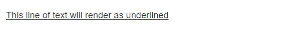
1 | <u>This line of text will render as underlined</u> |
小号文本
使用标签 <small>
着重强调
使用标签 <strong> 标签
斜体
使用 <em> 标签
文本对齐

1 | <p class="text-left">Left aligned text.</p> |
改变大小写
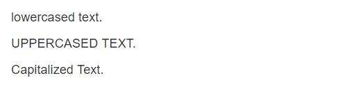
1 | <p class="text-lowercase">Lowercased text.</p> |
引用
在你的文档中引用其他的来源,可以使用 <blockquote> 来表示引用样式。对于直接引用,建议使用 <p> 标签。
1 | <blockquote> |
列表
无序列表
排列顺序无关紧要的一列元素。
1 | <ul> |
有序列表
顺序至关重要的一组元素
1 | <ol> |
代码
内联代码
1 | For example, <code><section></code> should be wrapped as inline. |
用户输入
通过 kbd 标签标记用户通过键盘输入的内容。
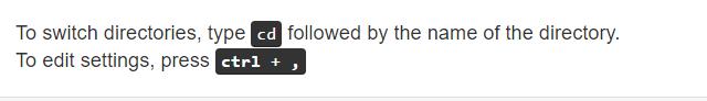
1 | To switch directories, type <kbd>cd</kbd> followed by the name of the directory.<br> |
代码块
多行代码可以使用 <pre> 标签。为了正确的展示代码,注意将尖括号做转义处理。
变量
通过 <var> 标签标记变量
程序输出
通过 <samp> 标签来标记程序输出的内容
期待后面的文章!